
 Versed Vaper Team
On November 20, global vape brand HQD officially announced its brand renewal, marking a bold new chapter in its 11-year journey.
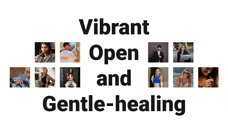
Fresher HQD: Vibrant, Open, and Gentle-healing
HQD has stood for Humanity, Quest, and Devotion — the values behind its name. But it has never stopped exploring.
In an increasingly stressful world and diverse vaping landscape, HQD recognizes that consumers now demand both premium products and brand-delivered feelings of energy, fun, and inner peace. In response, HQD launches a brand refresh — upholding its founding spirit while evolving into a more vibrant, open, and gentle-healing identity.
Fresher HQD: Fresher Visuals
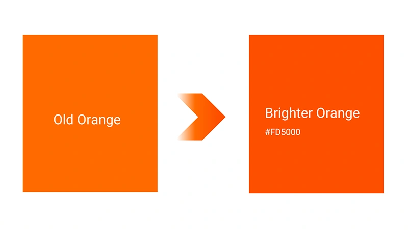
The heart of this transformation is a vibrant new visual identity. HQD’s brand orange has been reimagined as Brighter Orange—symbolizing vitality, curiosity, and confidence, and one that articulates the brand’s belief in providing joy and freshness with every puff. HQD also used this brighter orange to make a series of brand-new merchandise.
Fresher HQD: Fresher Slogan
The refreshed slogan is “Let’s Fresh the Moment”. It’s also HQD’s greeting to the world and a reflection of its spirit.
Centered on freshness, HQD wants to share with every user: the freshness of vaping, of being present, of vitality, of discovery, and exploration. With HQD, users can always find something refreshing, forget the noise, and simply enjoy the moment.

Fresher HQD: Fresher Symbol
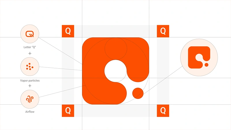
The renewed Q symbol also captures HQD’s evolving character. It integrates the letter “Q” with the vapor particles and airflow to form a smooth, dynamic shape — rounded edges signify vitality and openness. At the same time, squared elements represent wisdom and rational pursuit. It further embodies the brand’s balance between technology and emotion, creativity and precision.
Fresher HQD: Fresher Official Website
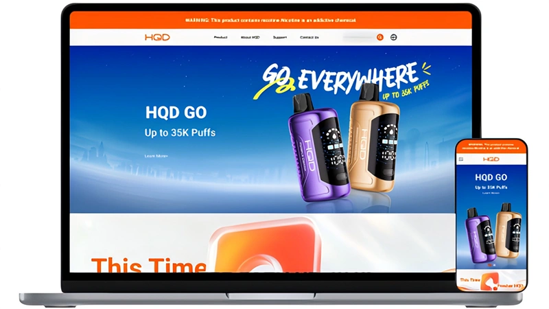
With its visual refresh, HQD has fully redesigned its official website. Featuring Brighter Orange, cleaner layouts, playful interactions, smoother navigation, and efficient info display, the new interface perfectly matches HQD’s fresh, energetic vibe — making visits inspiring, engaging, and effortless.
HQD official website: https://hqdtech.com/
Looking Ahead: Together, We Stay Fresh
HQD delivers personalized, aesthetically refined, and reliable products, from its CUVIE, GLOW, and GO series to future lines, while continuing to innovate for richer, more delightful global vaping journeys.
Beyond great products, it offers vitality, gentle healing, and warmth in this fast-paced era. For overwhelming moments, HQD acts as a friend to ease tension, bringing relaxation, clarity, and gentle healing, inviting users to explore life openly, think wisely, and embrace gentle healing comfort.
With HQD, stay fresh, together.


 Russ Ware



Add comment